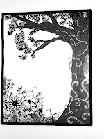
Monday, November 29, 2010

Utopian Design in Society

The backpack is in my eyes an underrated utopian design.
It is something for everyone, young, old, male or female, trendy or old fashioned, and nonetheless is useful to everyone. Though some may find it not as stylish as their luis purse, there are times when a backpack cannot be replaced. It allows the owner of the pack to be hands free while keeping them comfortable and safe. Saddles can have bad effects of wear and tear on the body by favoring one side, and could potentially put you off balance, though I agree that is rare. The only time a backpack could be harmful is when its weight can be overbearing, but overall, I would say it is one of the safest, most comfortable, and sensible ways to carry around our personal belongings. There are many types, from school backpacks, to hiking packs, to stuffed-animal packs from the zoo (or unstuffed animals with straps to be more accurate, later stuffed with papers and such).
image from
http://www.camelotbears.com/bears/panda-bears/panda_bears_apparel.html
It can be geared towards comfort and health precautions, with padded arm straps and horizontal reinforcement around the front for extra fit. Or it can be as simple as a kindergardeners favorite TV show character happily displayed in rainbow plastic on the back.
While its accomplishments seem minimal, I would say the backpack is a utopian design because so many of us have one and use it, which means its functionality must be good. But most importantly it allows us to move forward in society, by not having to think about how to best transport our belongings with maximum protection and ease, many of us chose the good 'ol reliable backpack!

Design is Dangerous


Traffic jam on Los Angeles highway. Photo by Atwater Village Newbie
The car.
It was designed to make our lives easier, give us more liberty and freedom so that we could rely less on the train, bikes, buggies, etc. We could get places faster and do it on our own schedule, not when the conductor shouted "all aboard!" The car was a luxury item, not  truly a necessity, and it has become a danger to our society for two main reasons.
The first being a direct effect to society and the way we interact. Since people drive places, we are less likely to see people walking down the street or biking by if we are all cooped up in our cars with the music blaring only thinking about when the light will turn green instead of enjoying the nice day outside. It also forces us to be places less often, and going to or getting to places longer. When the city is designed around the car, nothing is close and people are forced to drive and commute by auto, especially when public transportation is not promoted or thought of as a waste of money which in some areas is a true problem.
The second major danger is to the environment. It is no new fact that cars pollute, and that our supply of oil is not infinite, so why do we build cities around something unsustainable? Not only is the physical act of driving harmful to the environment, but the resources to build roads and freeways takes a lot of maintenance and is not friendly to the earth. The more paved roads we create, the less rainwater can be reabsorbed into the earth and less plants can be planted to filter our polluted air. I should not like to end up like Mark Altshuler's short film "Logorama" where we let corporate america take over and design everything purely for financial gains. Yes, the car can help us and be an easy alternative to walking or biking, but when does it go too far? When does the convenience of driving become a necessity because we MAKE it one, not because it actually is one.
While smaller and more efficient cars are great, they are still cars. And thats a fact.

image of a mall parking lot from http://www.makingthishome.com/tag/green/page/3/

COLOR TRANSFORMS

Color can transform a design in many ways, but it is most powerful in commercial marketing. My mother always told me that the only reason I wanted Lucky Charms Cereal was because the box was colorful, and she had a good point. Color displays subconscious messages and attracts our attention in many contexts, especially in the store. Josef Albers, in "Interaction of Color," mentions briefly that the differences in color; what we like what we dont like, how we feel about one color or another, depends upon the person. However, I will also point out that society has a lot to do with the way we perceive color, perhaps it is mostly a U.S. phenomenon, but I am sure it occurs in other places as well. For example, a blue toy is meant for a boy while the pink to toy is meant for the girl. So the box of Lucky Charms is rainbow colors, and therefore will appeal to all children because there are many colors and favorites to draw them to that product. Parents, on the other hand, I have found go for the simpler designs and not as many colors, because it implies a simpler cereal which they intake as a healthier product with less junk and additives. The way color is all in our heads, as Albers explains, because it changes depending on the context and is not always going to evoke the same visual experience, but he is certain that a different experience is going to occur.
So what if we switched around the color theories that marketing designers use for cereal, could we make kids beg and stomp for healthy cereal if the packaging is still colorful and enticing? Or another possibility, what if mom and dads cereal were suddenly springing with all the colors and funny cartoons, would they hesitate even if it was the same cereal inside?

Monday, November 15, 2010

society and its design: Davis

courtesy of clipart.com
I almost tripped over a curb the other day and was wondering who in the world designed a ramp that was going to have a protruding side curb. Especially being in Davis, I think not only a pedestrian, but a biker might not notice it and could seriously get injured. Perhaps there is a reason to make something more dangerous, maybe its function is to discourage bikers or others from using the ramp, but on the whole, I don't feel like that is a big enough problem that I am aware of to justify adding the curb.

There are many other design faults that seem to be present in community just beyond campus. For example, one aspect that I think would greatly improve davis is to add a pedestrian/bike cross in the middle of La Rue between Hutchison and Russel. It would increase safety since most people that live in the apartment complex across the street from campus jay walk all the time, jumping the curb on their bikes or having to slow down in front of oncoming traffic to get off their bikes and walk across the divider. In turn, a walkway would slow down traffic and create a more walking biking friendly environment for the students at UCD. Another reason for slowing down traffic is because many sports games are held on Hutchinson fields, and I have seen many stray balls go into the street and people then have to dodge speeding cars to retrieve them.  It would also break up the long stretch of road, and like they have done on Russel next to the Russel fields, it would be a reminder to drivers that pedestrians and bikers are common and keep them conscious and aware of their surroundings instead of just seeing a straight road that subconsciously means you can go fast.

Everyone could benefit from a crosswalk on La Rue, and I think it would be one of the smarter and more progressive designs that the city could implement instead of stupid useless ones like a curb on a ramp.

5 Areas of Ergonomics

Last year my mom cut her finger on a can that she had opened with an old-school can opener. The edge was so sharp that the cut it was bad enough to send her to the hospital on a weekend to get stitches and get a tetanus shot.
She was determined not to let it happen to anyone else, and found this new can opener by OXO that prevented this sort of catastrophe from happening. Here are five reasons why I think this can-opener is good for any household.

Safety Reasons: The difference between this can opener and other can openers is where it cuts the can. OXO has designed it so that it is actually slicing the lid on the inside of the lip which leaves the top round and smooth and cut free, a great safety feature that does not fall into the over-designed category, but solves a basic common problem that people often face when opening cans.

Level of Comfort: The handles are big and have a gradual curvature, which allows the grip to remain firm without receiving few and painful pressure points. The knob to turn the gears that cut the can is also nice and big with gradual curves instead of some of our earlier ones which had a metal bar that was very uncomfortable if the can became even slightly hard to open. Also, the material on the handle and the knob are soft yet have a slight roughness to allow maximum comfortable grip. Sand paper might be more useful in obtaining a good grip, but the comfort level would certainly be lacking.

Ease of use: Perhaps it is easier to use because it is a new blade, and new blades tend to be sharper than old dull ones, but I find that I still expect the can opener to catch or go off course which means I have to readjust and start all over again. The OXO can opener always has an easy and consistent cut line which surprises me every time since I have become conditioned over the years to anticipate frustration with can openers. The fact that it cuts on the inside not only is a safety design, but functions as an "ease of use" design since you don't need to maintain the can opener at and awkward angle. You put it flat down on the can and start turning and once it fits in to place its not going anywhere.

Performance: My can opener, that my mom bought me specially so I could have one in my apartment, has done everything that I have expected it to do. Like they say, it appears to the consumer as an effortless design. I have less worries while using it, I can enjoy it more and the results are consistently exceptional. Every time I finish cutting open a can I run my finger along the edge, just to make sure, and without fail, it produces a smooth safe surface that I wont get cut on and also is safe to put in the recycling without future danger. It has not failed me yet because it remains a simple design; not batteries or electronics required, so it is sure to last for a long time.

Aesthetics: Last but not least, the look of the can opener is what you would look for in a kitchen utensil. It is all black, which goes with many pots and pans and other gadgets in the kitchen, and is a simple design look that will appeal to most customers. It does not appear to have any extra parts that would confuse a user, therefore its form is relatively explicit about its function, and while it is not exactly the same as the earliest can openers, which as I mentioned before have metal handles or bars in certain places, it is a recognizable tool that will go in anyones kitchen.

Overall, I am very satisfied with this product. It is a great example of how we can improve modern tools and designs to make them better and not just "fancier." I don't need internet on my can opener so don't try to make my phone come with one. Often, less is more, and this product is everything and nothing more than what I want in a can opener.

Monday, November 8, 2010

whats your function?


http://www.youtube.com/watch?v=Ht96HJ01SE4&feature=related

One aspect of design that I love, is the idea that a design can have many unintended purposes as I have stated before in previous posts. The discovery of new functions for old forms is largely under-practiced. As Professor Housefield in DES 001 at UCD says, we should all, even as adults, be involved in "play." This youtube video is from a group in Canada that decided to use mostly computer parts to recreate the famous Bohemian Rhapsody song.
Despite its entertainment value, it actually is a great example of many important design elements. The form of a design often directly reflects it function or purpose. When we see a scanner, we see the place where you put the paper to be copied, the place where the new copy will come out, and all the buttons to make it start and stop. What we do not see is a guitar, or a musical instrument to be even more broad. That is where constraint can test not only a designer, but the consumer of the product when putting a design to work. Through play, we might more easily discover these non obvious abilities that form has.
The concept or the message that the video sends is that you can do something cool with unexpected tools and allow many people to enjoy it, especially thanks to youtube and other mass media, our design and uses of design can be widely shared to promote more imagination and stretch the limits of possibilities.

Words Images Power

i-want-you-flat.jpg
This image, of uncle sam, has power because of the combination of words and the image. Separately, "I want you" is such a broad phrase that is doesn't have any strong obvious implications when you read it and don't know its context. Granted, the typeface does send a message of being a stern strong statement because it is in all caps and the word "you" is enlarged and colored opposite the other two. This striking contrast focuses the eye on the word "you" while the mind puts emphasis on the meaning.
 The picture on the other hand, is an obvious reference to the United States of America, with the red white and blue colors represented in the national flag, as well as the old school top hat and the clothes worn by the early Americans. By covering up the words, it look as if a man representing "America" might be scolding the viewer since his brows are slightly furrowed and his mouth is slightly turned down in a frown.
But we all know that Uncle Sam was recruiting us for WWI, and the message sticks with us today because it was such an intense combination of words and image that we can even associate it now to this meaning with just one of the two components, i.e. just the words of just the image. We have had significant exposure to assume this specific image always goes with these three words. Someone who was not familiar with the add and saw the picture by its self would lose the meaning of the combination, and that is how we know the importance of them working together.
Oh the power of words and images.

What I word see if I knew what to look for

Comics. A largely under-rated art form. I think one of the reasons is we think, “comics are so easy to understand.” And we think, compared to a high level novel or text book, that reading comics is so effortless and shouldn’t be taken seriously. 
But think for a second, why IS IT that we understand comics so well? Why does a comic strip get across a message that even the best film cant portray from the book, and the message that cinematography can say that a book cant? 
The reason? Words working in unison with images. The Gestalt principle that the whole is greater than the sum of its parts is never better used than to describe the relationship words have when used in conjunction with images. Brian Fies, a cartoonist who has published two comic books, uses this power in one of his works to help his reader understand the hardships of someone in the family having cancer. I think of it as, a picture is worth a thousand words, but that picture says fewer and more specific words when it is paired WITH words. The words help narrow down the picture of the language, and the pictures help say what the words cannot. It is the same way body language is a huge component of human communication, it is not just what you say, but HOW you say it, and comics allow us to put that third variable of communication, combining the visual and verbal aspect of understanding, and putting it on paper. If I say “nice to see you again,” I could be honest or sarcastic and you wouldn’t know with just words. I would have to tell you, that Im saying it sarcastically. But if I drew some pictures of someone rolling there eyes and slouching and with a disgusted look on their face, you would understand quicker and more clearly that I meant it in a certain way.
That is the power of comics and its unacknowledged powerful use of images and words. 

Monday, November 1, 2010

The Death Star at UCD


Many of the students at UC Davis are familiar with the building nick-named the "Death Star" for its futuristic angles and shapes that make it one heck of a maze to wander through.

It is, none the less, a very interesting design.
As someone who tried drawing it incorporating perspective, the building was more challenging than I had anticipated because it offers many design and art theories that change with any slight change of positioning within the buildings walkways and staircases.

The first and foremost aspect of the building that really makes it feel like a maze is the lack of change in color between the walls and the floor, and how the time of day and lighting makes one wall and floor look continuous while others have powerful shadows. The entire building is cement gray, and therefore, where a wall in the distance meets a foreground, the eye can easily get confused at the angles and the distance and even the surface they are perceiving. There is also a lack of symmetry, which does not always stand out at first but to which the eye must grow accustomed to. Because there is no symmetry, the focal points can be giant spaces where many walls and angles meet, but also allows for multiple focal points, such as a big window in a slanting wall, or a tree in the courtyard which makes a strong contrast with its organic shapes to the straight hard man made angles of the building.

I highly recommend taking the time to walk around the building and think about the angles you see, not the angles you assume are there. Look for as many design aspects, color, size, shape, texture, contrast, functionality, and aesthetics. The building is sure to get you turned around, so be adventurous as a first timer, or if you think you know your way around, try and find a new way in and a new way out, explore the idea of not having a grid pattern and still being able to get to the same spot by taking a different path. Get lost!
Have fun :)

Ring Ring Riiiiing

Take a look at your phone. Examine all the fancy new features it might have, be it internet, the latest games, voice activation or itunes top 10 songs as your ringtone. It has become an accessory that can match any outfit with all the latest phone covers that sport your favorite color or your dedication as a sports fan with your favorite team logo. Visually, the phone has gone from a clunky, typically black heavy object, to a small sleek and slender personalize-able rectangle that is becoming easier and easier to lose. While some phones best feature is the visual appeal, what does color, shape, size and durability mean if basic functions are not being improved.

I find that while phones are becoming more and more advanced, many are missing simple functional aspects. For example, is it not true that most phone screens become extremely difficult to see in direct sunlight? The content of the phone, the literal message that your object is displaying to you through icons on your iphone or just the numbers of the time of day on your home page, is being overlooked and left behind in the marketing world when companies feel the need to engineer the best keyboard or the coolest applications.

When is design going to take a step back and look at the most important part of its objects, the reason it was designed in the first place. Isn't a car a car if it gets you from point A to point B? So why isn't my phone even letting me make a call in the middle of the day? Why does it seem that design is moving in a direction that is sacrificing function for form?

Content and form working as one

Cover of the DVD of "Objectified" by Gary Hustwit
The documentary "Objectified" by Gary Hustwit brings up many situations in which content and form work together. When we think about content and form, its is usually the form that determines the content, but what happens when it is the other way around?


taken from "The Glorious Toothpcik" on the Journal of the American Enterprise Institute


In the film, they bring up the discussion of the toothpick, and everyday recognizable object for most people in our society. One man brings up the fact that many do not know the Japanese toothpick has a decoration on the end, perhaps to serve as decoration, but can also be broken off to show that it has been used. Furthermore, the tiny bit that is broken off can also be used a stand. This makes me think how the form of an object can change when you better understand the content. If you do not know that you should break of the end, you do not understand the full meaning behind the design, and therefore you do not use its form to its full potential. Such a simple object can be enormously misunderstood, and the design of the toothpick greatly underestimated. Now we might be wondering what else we are we using everyday, and yet not using at all? And perhaps a better question might be how do we avoid this under-usage of design? Do we need to have instruction manuals for toothpicks? Or can the design somehow better speak to its audience about its form and content and how they work together? Design is all about its relation to society, and when a society does not understand the content, how can they fully understand the form? Maybe we should ask design to speak more clearly, or is it those little unknown facts that make design interesting, since this means there might be infinite ways in which we can "newly" use the tools we already posses.

Monday, October 18, 2010

going green

I would like to dedicate this blog to mother nature, because she is an ever changing wonder that no designer can redesign, no matter how clever or how skilled.
these drawings are recycled thick styrofoam padded posters that were headed for the dumpster. I used the back as a new clean surface and with sharpie and tape created a border and image.

When we think about the ethics of design, as my Design 001 teacher, Housefield, at UC Davis mentioned in class last week, it should always be about reconnecting with the true idea of beauty and "creation" which is nature. We should use nature, the universal idea of beauty, and incorporate what nature does with its creations. Recycling, for example, is not a man made innovation, the earth has been recycling since it started. Nutrients and minerals change from soil in the ground to food in the plant to flowers on the stem and back down to the soil once it falls off.
Design should be about creating an ecosystem of art, where we can create and use every thing by finding different purposes and usefulness in our design pieces.
One way I recycle in design is I take old broken jewelry that people would rather throw away that fix, I take it apart, and by combining different beads and pieces from old jewelry I create something new and beautiful. The same goes for clothes, when I don't like the way a shirt fits, I cut it up and make it new, or turn it into a purse or  pillow or anything. Design can be changing things, not just "starting anew."

The wonderful part about being a designer is that we can taylor things to our liking, things that already exist, and therefore help preserve the world around us. My goal with design is to link it to everything else in our world, which right now many believe to be a global crisis of the loss of natural habitat and important resources.

Use design as a tool, not just as an art. Use design as a way to show your effort, not just to show your skill. Use design to help the world be and stay more beautiful, not to destroy it.

Comparing and Contrasting

Tree Art displays along the San Diego Harbor
Two dimensions versus three dimensions. How are they different and how are they similar?

Picture a window that opens up a lovely vineyard with big purple grapes and curly green vines stretching out for miles and hills in the distance. What is the difference in experience if you were to take a photograph of a place like this versus sitting at a real window looking out? The mind can be tricked, so it cannot be the visual aspect. A photograph captures perfectly every detail, every shadow and every line. What it cannot provide is a different point of view, a new angle or a new perspective. Two dimensions will always give you the same image and the same structure no matter how you look at it. If you sit perfectly still, sitting at the window will give you the same experience, but when you move, you might see farther to the right or farther to the left.
If we think about the difference in design, why would a design in a two dimensional space be different than a three dimensional space? René Magritte explains  very well how we might think of the differences between what we often look at on paper versus a sculpture or a crafted object. In The Treason of Images (1928-1929), Magritte writes in his caption "this is not a pipe" though the drawing is of a pipe. He seeks to emphasize the difference between the "idea" of something, its representation and Jean Piaget's theory of object permanence, which is the idea that we know something exists even when we don't see it. Magritte might point out that often we do the opposite of object permanence, we think something exists when it is in fact not a "thing" at all, but another form of that thing.

So, though it is not the visual aspect of a two dimensional design versus the three dimensional design that is different, because ultimately they can be almost the same and therefore infer a similar experience, it is the idea and the mental knowledge of knowing that the design is portraying while the three dimensional design is. 

Design as Conversation

There are many ways in which the human being can communicate, just as there are many languages that exist in our world. Who's to say that design is not a form of communication, because everyday in our modern world design is becoming more important at sending specific messages when presented to an audience.
Not only is it a way to transmit information, but it allows the same subject, the same topic, or the same design piece to invoke an infinite amount of ideas, debates, and conversations. Just as a linguist would point out, there are an infinite number of possible sentences to be created, and if in a language that we understand, we can decipher the sentence even if we have never heard it before. "I cook frozen branches on sundays because thats when the bird sits on my windowsill" is a sentence you have never heard before and yet you still understand it.
 Design is the same way.
Design provides us with an endless source of information that can always, in one form or another, be understood and interpreted. The difference between design and languages, is that we use our senses as our communication tools instead of our mouth and tongue. Sign language is the closest "language" in its formal definition that bridges the "language of design" to the "speaking languages." When we experience design, we internalize it and make judgments and inferences about what we see, touch, smell, feel, and hear. Toys"R"Us is not going to have the same font design as Coach, because a children's toy store needs to imply fun, happy, and playful ideas where as a top brand design label is going to want to be sophisticated and chic.
Next time you are eating cereal, look at the box, and ask yourself what kind of a message is the design on the box sending and you might be surprised to realize that what you thought you "knew" about the cereal was not being told to you by the words on the box, but the design on the box.

Monday, October 11, 2010

Pink and powerful

This blog is all about "design in society" in every way shape and form. Just today, as I was searching my mind for something to blog about, I took a bite of cereal and looked down at my spoon because I simply had nothing better to do.  The back of my spoon said "Designed by Simon Legno" and I thought "oh boy! its design in society! Its design in my room!" And it reminded me of why I had kept this pink spoon.


As I'm sure many of you are, Yogurtland is one of many frozen yogurt places to pop up all over town and allow you to indulge in your favorite flavors with a variety of yummy toppings. And because it is so good, I want to go as many times as my wallet can afford. The only problem I have consciously about eating frozen yogurt often besides the spending aspect is the idea of waste. When I buy ice cream, I can buy a cone and all I throw away is a little paper that wraps around. But with frozen yogurt, there are only bowls which require spoons. Legno designed a spoon that is not only colorful and cute with different characters sitting at the top, but a pink plastic spoon that is biodegradable. When I first read the back of the spoon while enjoying my frozen yogurt, I was so impressed that a frozen yogurt place had bothered to make a eco-friendly spoon. For me, Legno designed not just for Yogurtland, but he also took in to consideration his eco-conscious customers who could indulge in a bite of yogurt and have one less guilty thought in mind.

Design from Without

A design for a friend who lived on the fifth floor of her dorms
"Think outside the box" is a common saying that generally means "think differently and in a way that no one has thought before." How, you may ask, is this possible?

I say do the opposite, by thinking inside a little tiny insy-wincy mini box.

You say I'm crazy.
Let me explain.

When people say, "draw me something, anything" we always go with our strongest animation, be it a stick figure or a heart or a dog that you have doodled on your page a million times. Having little restrictions means that you get to stick with what ever you normally do and what you are comfortable with. So how can a person get inspiration from elsewhere if they don't need to look anywhere to get what they need?
By putting a restriction, the tightest boundaries on a project, it becomes necessity to forget that buffer and search all possibilities around for inspiration. I find that my creativity expands and is tested because I must step out of my comfort zone and use my surroundings to guide me in the right direction. Try this exercise that I had in an art class one year. Trace your hand in pen and make a picture that integrates the outline of your hand but is something realistic. No, the turkey is not an option, but its a good example of how you can still distinctly tell its a hand and a turkey at the same time.

...don't be shy, you might have to look around you and "without" for ideas and inspiration...

Stone Soup


The tale of Stone Soup is told in different ways with the same message, two heads are better than one, or in this case, many heads are better than one. It might even explain why and how communities thrive, by relying on each other, using a collective grouping of resources to accomplish a common goal.

In my Design class at UC Davis, we took the stone soup "method" and applied it to design itself to create a stone soup of art. The picture shows our creation in its final stage, but it is the process that I would like to share with you in more detail because creating something, as we all know, is not just about the end product, but about the process which provides substance to any creation.

Our design was not meant to have a deep symbolic importance, but rather just a project that we, as a collective group, could enjoy and experience. We only had a short amount of brainstorming before we went right to it, on our hands and knees trying this piece of twine here and stacking this box there. It was as much fun as it was frustrating, since without a real plan, stability was always an issue, and when something didn't work, we turned around and tried something new by getting a new piece to steady something, to alter it with tape or wire, or simply to throw the idea out and grab something new.

To say the least, it was not what I had expected, because when you work with others, you must always remember that others will have different and often better ideas, and never the less, it is important to always work together, be it in a stone soup project with things you find in your desk drawer, or when remodeling a living room for a customer, or building a new city hall, because what we create, we create within a setting. It is all about design in society.

Monday, October 4, 2010

Space 4 Art

This summer I had an opportunity to see the power of art, design, and culture, and how they can spread positive energy and motivate people. Space 4 Art is a live/work space for local artist living in San Diego who receive the opportunity to have not only a space to design freely, but to be surrounded by supportive people in a community that is realizing the importance of design.

Space 4 Art opened my eyes to the idea that art and design are more than beauty and more than the creation process, but essentially the context in which it is in. They value the freedom to express yourself through any and every art form. But what I liked most about Space 4 Art was their constant awareness that the poeple around, those who lived down the block or those who came in to the space, were important and should benefit from the space. It was them reacting to the community that makes it more appealing than a plain old museum, becuase art and design is nothing without the reactions and interactions that people have with it. I am not trying to downplay museums, I think they are great and everyone should try to find some that spark their interest, be it a museum of art or of science or natural history. But what I found is that when they reached out to the community by offering workshops of street art for high school students or classes for anyone interested in the everyday fun of photography, I knew that art and design are essential to our communities and societies, to let people be creative and explore their imagination the same way that schools push students to learn.

I wish there were more outlets for people to interact, communicate, and experience art and design the way that Space 4 Art does for the community of San Diego.

what is design

Discussing the meaning of a word is a wonderful conversation and a never ending debate precisely because  people can never truly be right or wrong. Design is a subjective analysis that needs an individual perception to first take place.


Some could argue that because design has no clear definition it maintains a lower reputation in the critical world and should receive less respect because of its lack of objectivity. I would argue the contrary. Why? Because most of the things we experience in our world are from a completely biased perspective, not to say that is good or bad, but looking at design is most like looking at the real world. When everyones ideas about design are what make design, does that not give the individual, be he/she a world renowned designer or not, equal opportunity to shape what design is now and what it will be tomorrow?

If design is the experience of our senses in relation to something that someone has made, wouldn't the way I interpret it be right according to me and the way you interpret it be right for you? If you feel happy when you see a neon pink chair, then why should that design not be a "happy design" is that is how you react?
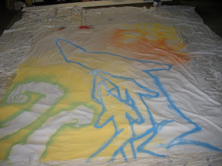
Design to me, is the combination of the functionality of a thing and its effective attractiveness, be it the color, size, shape, texture, or quality. It is impossible to avoid design, the room you sit in, the street you drive on, etc, and designers constantly re-evaluate areas to create a better more positive experience that better solves a problem and often serves it function by communicating with people. If I want more young people to come to my city, I will design the city with more playgrounds so families feel its a family friendsly neihgborhood, or with a nice down town and good bars and restaurants to attract the young adult.
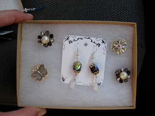
In the simplest terms, you can think of a world without design like a world without senses. A world withought senses  gives no opportunity for intelectual growth. Humans are unique in their ability to look at something and be able to analyze it. People can contrast one object with something that is in juxtaposition, or relate it to something more abstract, like a memory. Design explores the power of the human mind and emphasizes the difference between the human thought process and all other living things. Why does a pink chair make you feel happy? Why not a navy blue chair?
When we talk about design, design is the nail and our mind is the hammer, and everyone will hit the nail in, but never in the exact same way.

Humans not only have the ability to use tools, but are capable of making them, to make them better, to make them more effective in every way shape and form. The everlasting argument about what design is parallels designs endless possibilities.

So what is design?

Its a great conversation starter.

design in disguise


The word “design” brings to mind forms, like objects such as chairs, children’s toys, pens, and cars, but it is the space that design can create which makes it especially unique. The inside of a building can have four ninety degree walls, but if in one room the ceiling is thirty feet high and the other is only ten, the element of space is powerful and will change the experience of the design.
Thinking about my first positive memory associated with design, I bypass the traditional objects such as the Barbie doll and remember a space that has a lasting impression on my idea of what design is. 
My side porch in the house I grew up in created an interesting pathway. Because my house sits on a hill, the ground beneath the porch is slanted, leaving enough space for an adventurous child to crawl on hands and knees and explore the unknown. The experience of the space makes a lasting memory because it was very much unlike the top of the porch, the intended pathway. Beneath was dirty, narrow, full of bugs, and left enough cobwebs in my hair to decorate the house for Halloween. 
Combining the sense of rebelling against clean clothes and tknowing that no parents would or could manage to go down there, made it isolated and and my own secret garden away from chores, rules, and authority. 
 While this, I'm sure, wasn't an intended design element, it was present none the less. 
Design often has that effect, the unintended effect. If the designer of the porch had added extra support beams running perpendicular to the long passageway, it would be a different design, create a different space, and would have disallowed me to experience the space beneath my porch. Thinking about this possibility, it reminds me not to see the obvious functional effects that design is created for, but to think and explore the possibilities of the ways in which a desing, especially through space, can create unpredictable experiences.